A fresh coat of paint can completely transform a home’s exterior, but choosing the right color scheme requires more than picking colors you like. Modern exterior palettes lean into clean lines, intentional contrasts, and materials that complement rather than compete. Whether someone is repainting a 1970s ranch or updating a new-build farmhouse, the goal is the same: create visual impact that feels current without chasing trends that’ll look dated in three years. This guide breaks down what defines modern color schemes, highlights palettes gaining traction in 2026, and walks through how to match colors to a home’s architecture and materials.
Table of Contents
ToggleKey Takeaways
- Modern house exterior color schemes prioritize restraint, high contrast, and material integration over trendy colors, using simplified two-to-three-color palettes with matte finishes for a sophisticated, timeless look.
- Top modern exterior color palettes for 2026 include monochromatic neutrals with bold accents, warm earth tones that ground homes in their landscape, and dark dramatic contrasts like matte black siding with white trim.
- Successful exterior color choices must work with permanent features like roof color, architectural style, and existing materials—test paint samples on-site across different times of day to ensure colors work in natural lighting.
- Coordinate your exterior colors with landscaping, hardscaping, and neighborhood context to achieve distinction without clashing, while considering climate and maintenance requirements for long-term appeal.
- Bold door and trim colors on neutral body colors add personality to modern house exterior color schemes without overwhelming the design, creating visual interest and defining architectural edges.
What Makes a Color Scheme Modern?
Modern exterior color schemes aren’t just about picking trendy shades. They’re defined by restraint, contrast, and how colors interact with architectural features and surrounding materials.
Simplified palettes dominate modern design. Most contemporary homes use two to three colors maximum: a main body color, trim or accent color, and sometimes a bold door or shutter tone. This keeps the eye moving without visual clutter.
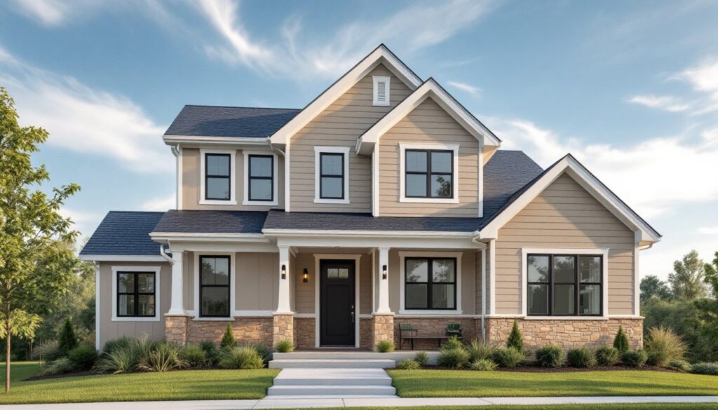
High contrast is intentional. Modern schemes often pair light with dark, think charcoal siding with crisp white trim, or warm beige stucco against black window frames. The contrast emphasizes rooflines, windows, and other architectural details rather than hiding them.
Material integration matters. Modern exteriors don’t fight natural materials. If a home features stone veneer, board-and-batten siding, or stained wood accents, the paint palette should enhance those textures. A scheme that clashes with existing brick or a metal roof will always look off, no matter how popular the colors are.
Matte and satin finishes have largely replaced glossy exterior paints in modern applications. Flat or low-sheen finishes minimize surface imperfections and lend a more sophisticated, understated look. Reserve semi-gloss for trim and doors where durability and cleanability matter.
Colors also need to work across all exterior elements, siding, trim, soffit, fascia, gutters, and doors. A modern scheme coordinates these without making everything match. For instance, gutters and downspouts in a dark bronze finish complement warm neutrals better than stark white aluminum.
Top Modern Exterior Color Palettes for 2026
Monochromatic Neutrals with Bold Accents
Monochromatic schemes use varying shades of a single color family, grays, whites, blacks, or beiges, across siding, trim, and architectural details. The appeal is visual cohesion: the home reads as one clean volume rather than a patchwork of competing colors.
Popular combinations include light greige siding (Sherwin-Williams Agreeable Gray or Benjamin Moore Revere Pewter) with white trim and a matte black front door. Alternatively, charcoal gray siding paired with slightly lighter gray trim and black window frames creates a sleek, urban look that works on contemporary and mid-century modern homes alike.
The key is contrast in value, not hue. A pale neutral body with bright white trim still offers enough distinction to define edges and architectural lines. For added personality, introduce a bold accent on the front door, burnt orange, deep teal, or even a warm terracotta. This single pop of color keeps the palette modern while adding character.
Monochromatic schemes work especially well on homes with interesting geometry or mixed materials. When siding, stone, and metal details share a tonal range, the architecture does the talking.
Warm Earth Tones and Natural Hues
Earth tones have made a strong comeback as homeowners move away from stark, cool grays. Warm neutrals, terracotta, clay, ochre, muted olive, and sandstone, ground a home in its landscape and pair beautifully with natural materials like wood, stone, and brick.
Terracotta and rust tones are gaining traction, particularly in arid or Southwestern climates. A soft rust body color with cream or off-white trim evokes adobe architecture without feeling dated. In wetter climates, deeper clay tones hold up visually against green foliage and gray skies.
Olive and sage greens offer a modern alternative to traditional greens. These muted, grayed-out greens read as neutral from a distance but add warmth and connection to natural surroundings. Pair olive siding with natural wood accents and black or bronze trim for a look that feels organic and contemporary.
Warm beiges and tans remain versatile workhorses. A medium tan body with darker brown or charcoal trim delivers timeless appeal without the coldness of gray. These palettes suit a range of architectural styles, from craftsman bungalows to modern farmhouses.
When working with earth tones, avoid yellowy beiges or peachy terracottas that can feel dated. Stick to grayed, muted versions with good depth. Test samples in different lighting, warm tones can shift significantly between morning and late afternoon sun.
Dark and Dramatic Contrasts
Dark exteriors have moved from edgy to mainstream. Deep charcoals, blacks, navy blues, and forest greens create striking curb appeal and provide a bold backdrop for lighter trim, natural wood, and landscaping.
Matte black siding with white trim is the quintessential modern look. It works on everything from simple ranch homes to complex multi-gabled designs. The high contrast draws attention to architectural details, window grids, board-and-batten lines, or decorative brackets all pop against a dark background.
Dark colors absorb heat, which can be an issue in hot climates or on south- and west-facing walls. Modern exterior paints often include reflective pigments that mitigate heat absorption, but it’s still worth considering climate and sun exposure. Dark colors also show dust, pollen, and water spots more readily than lighter tones, factor in maintenance and local weather patterns.
Navy and deep blue-gray offer a softer alternative to black while maintaining drama. These tones pair well with brass or gold-toned hardware, natural wood doors, and white or cream trim. They’re especially effective on coastal or lake homes where they echo water and sky without resorting to bright nautical blues.
Forest green and charcoal green exteriors feel both modern and timeless. They blend into wooded or heavily landscaped settings while still making a statement. Pair with natural cedar shakes, stone accents, and black or dark bronze trim.
One caution: dark exteriors can make small homes feel even smaller if proportions aren’t balanced with lighter trim or strategic accent colors. On compact homes or those with minimal trim, consider using dark tones on accent walls or upper stories rather than the full facade.
How to Choose the Right Colors for Your Home’s Architecture
Color schemes should enhance a home’s architectural style and existing materials, not fight them. Start by identifying what can’t change, roof color, stone or brick veneer, window frames, and build the palette around those anchors.
Roof color dictates a lot. A dark gray or black roof pairs well with nearly any body color, from whites to dark charcoals. A brown or terra cotta roof limits options, warm neutrals and earth tones work best, while cool grays can look mismatched. If the roof is newer or in good condition, it’s staying. Choose siding colors that harmonize rather than trying to work around it.
Architectural style provides clues. Modern and contemporary homes handle bold, high-contrast schemes and dark colors well. Craftsman and bungalow styles often look best in earth tones with rich, contrasting trim. Mid-century modern homes suit both monochromatic neutrals and unexpected accent colors, think a soft gray body with a chartreuse door. Traditional colonials lean toward classic palettes like white or cream with black or navy shutters.
That said, rules are flexible. A Victorian painted in modern dark gray with minimal trim colors can look stunning. A ranch in sleek black and white sheds its dated vibe overnight. The key is committing to the vision and executing it consistently across all elements.
Test samples on-site. Paint looks different on vertical surfaces than on a horizontal chip, and lighting changes everything. Purchase sample quarts and paint large sections, at least 2’x2′, on different sides of the house. Observe them over several days in morning, midday, and evening light. Colors that look perfect in showroom lighting can skew too warm, too cool, or too flat in natural conditions.
Consider the neighborhood context without copying it. The goal is distinction without clashing. If every house on the block is beige or gray, a dark exterior or warm earth tone palette will stand out in a good way. If the street features a mix of bold colors and styles, a more restrained palette might offer welcome contrast. Some HOAs restrict exterior paint colors for resale value or neighborhood cohesion, check covenants before buying paint.
Coordinate with landscaping and hardscaping. A dark exterior looks dramatic against lush green landscaping or clean white gravel. Warm earth tones pair beautifully with native plantings, stone pathways, and wood fencing. If the front yard features red brick walkways or a stone veneer foundation, choose siding colors that complement those warm tones rather than compete.
Factor in maintenance and climate. Dark colors fade faster in intense sun and require more frequent repainting. Light colors show dirt less but can feel stark in certain climates. Coastal areas benefit from colors that resist salt air and UV exposure, many paint manufacturers offer region-specific formulas. Similarly, homes in wooded settings might want colors that camouflage pollen and organic debris.
Finally, don’t forget trim, doors, and details. Trim color defines edges and can make or break a scheme. White trim is safe but stark: off-white or cream softens the contrast. Dark trim on a light body creates modern definition. Doors are an opportunity for personality, if the main palette is neutral, a bold door color (navy, red, teal, or mustard) adds visual interest without overwhelming the design.
For more inspiration on coordinating colors with architectural details and landscaping, resources like modern home decor sites showcase real projects that balance aesthetics with practical material choices. Similarly, browsing curated interior design galleries can reveal how exterior palettes set the tone for a home’s overall style.
Conclusion
Choosing a modern exterior color scheme is about more than trend-chasing, it’s about creating a cohesive look that complements architecture, climate, and personal style. Test samples thoroughly, consider long-term maintenance, and don’t be afraid to commit to a bold direction. A well-executed palette transforms curb appeal and makes a home feel intentional and current.